Wayfinding at San Francisco State University
Bringing Direction, Accessibility, and School Pride to SF State
Personal Case Study
UX/UI Design
iOS Feauture Concept
Project
Wayfinding at
San Francisco State
Type of Project
Capstone Project
Role
Graphic Designer
Skills
Figma, User Research,
Wireframing, Prototyping
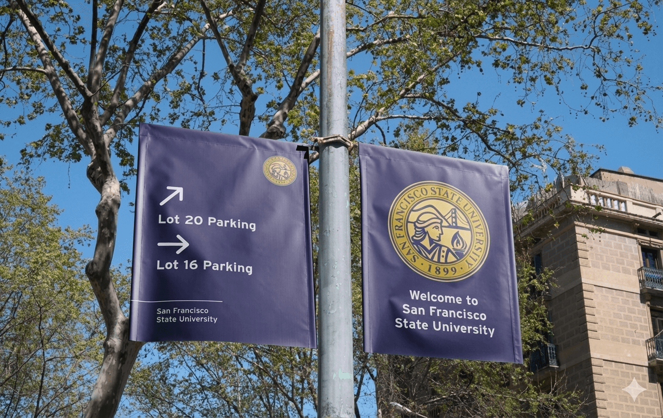
The Problem
Navigating SF State’s campus is unintuitive for first-time and returning visitors.
San Francisco State University spans a large, dense campus with buildings that vary in layout and architectural style. Without a clear system, navigating the space can feel overwhelming.
Existing signage lacks consistency.
Hierarchy, visual language, and placement vary across campus, forcing people to rely on trial and error, digital maps, or asking for directions.
The real challenge was system-level clarity.
This project focused on creating a cohesive wayfinding system that could guide people confidently while remaining flexible, accessible, and maintainable over time.
Role & Constraints
This was an individual capstone project.
I led the project end to end — defining the problem, conducting research, and designing the wayfinding system from concept to final presentation.
The work was developed in an academic context.
The system was not implemented on campus, and decisions were informed through observation, secondary research, and design best practices.
Constraints shaped the solution.
Limited access and time pushed the design toward scalability, clarity, and real-world feasibility rather than polish for implementation.
Capstone Booklet
This booklet revisits my capstone project from 2023 at San Francisco State University, where I designed a campus wayfinding system grounded in real student behavior and everyday campus friction.
Below is the project as it originally shipped ~ my research, thinking, and final system ~ shared to set context before reflecting on how I’d approach the problem today.
Use the right-hand nav to jump between pages or sections.
Revisiting After Two Years
Looking at this project now, the core ideas still hold up. The system is clear, the intent is solid, and the deliverables address real navigation challenges. With more time and experience, I can also see clear opportunities to improve clarity, consistency, and how the system scales.
Clearer Arrow Hierarchy
The current arrow system uses overlapping directions, which can cause hesitation at key decision points. If redesigned today, I’d introduce a clearer hierarchy through spacing, sizing, and visual priority so the intended direction is immediately clear.
This would create a more connected, modern experience ~ especially for first-time visitors.
What I’d change:
Separate arrows spatially instead of stacking
Establish a primary vs. secondary direction system
Reduce cognitive load at intersections
QR Codes as a System, Not a One-Off
One sign included a QR code, but in hindsight, it should’ve been part of the entire wayfinding system.
What I’d change:
Add QR codes to all major deliverables
Link to maps, accessibility routes, and real-time info
Treat digital touchpoints as a core extension of physical signage
Stronger Consistency Across Deliverables
With more experience designing systems, I now see opportunities to tighten consistency across all pieces.
What I’d change:
More consistent spacing and alignment rules
Clearer typography hierarchy across signs
A shared visual language that scales campus-wide
How I'd Lead This Project Today
Today, I’d approach this as a living system — not a fixed set of deliverables.
My Focus would be on:
Designing for Scale
A modular wayfinding system that evolves with campus growth.
Validating in Real World Enviornments
Testing signage clarity before roll out
Collaborating across Disciplines
Partnering closely with accessibility, facilities, and student groups.
Connected Navigation
Ensuring signage and digital tools work seamlessly together.
Design Is Never Finished
Revisiting this project reinforced a belief I carry into my work today: good design isn’t about getting everything perfect the first time ~ it’s about building systems that can grow.
This reflection captures how my thinking has evolved, and how I now approach projects with a stronger focus on clarity, scalability, and long-term impact.

throughnateseyes
made by nate bautista