Campus marketing, eight months
Marketing at Mashouf Wellness Center
I was the graphic designer for Campus Recreation at SF State, making the flyers and stories that got students into trips, classes and jobs. This is what survived, and what I would change.
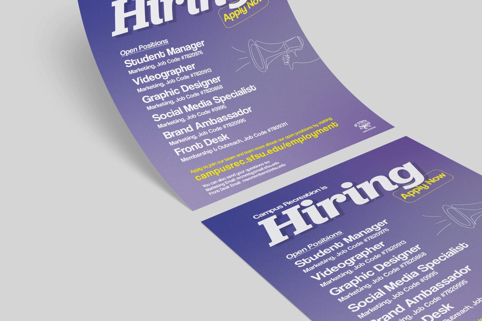
One building, nine thousand students, and something new to announce every week
Campus Recreation runs the gym, the pool, the climbing wall and the intramural leagues inside Mashouf Wellness Center at SF State. I was its graphic designer for eight months, part time, while I finished a design degree on the same campus.
The standing job was two or three events a week. A backpacking trip, a hiring push, a schedule change for the summer session, a table in the lobby on Halloween. Each one needed a set of assets: a story for the department's Instagram, which about nine thousand students followed and which posted three times a week, and print for the moments students were already inside the building.
I made the assets. Social media managers and marketing managers decided when they ran and where. That split turned out to be the most useful thing about the job, because it meant I could not rescue a weak piece with better timing or a second push. Whatever a sheet did, it had to do on its own, in the couple of seconds somebody gave it on the way to a treadmill.
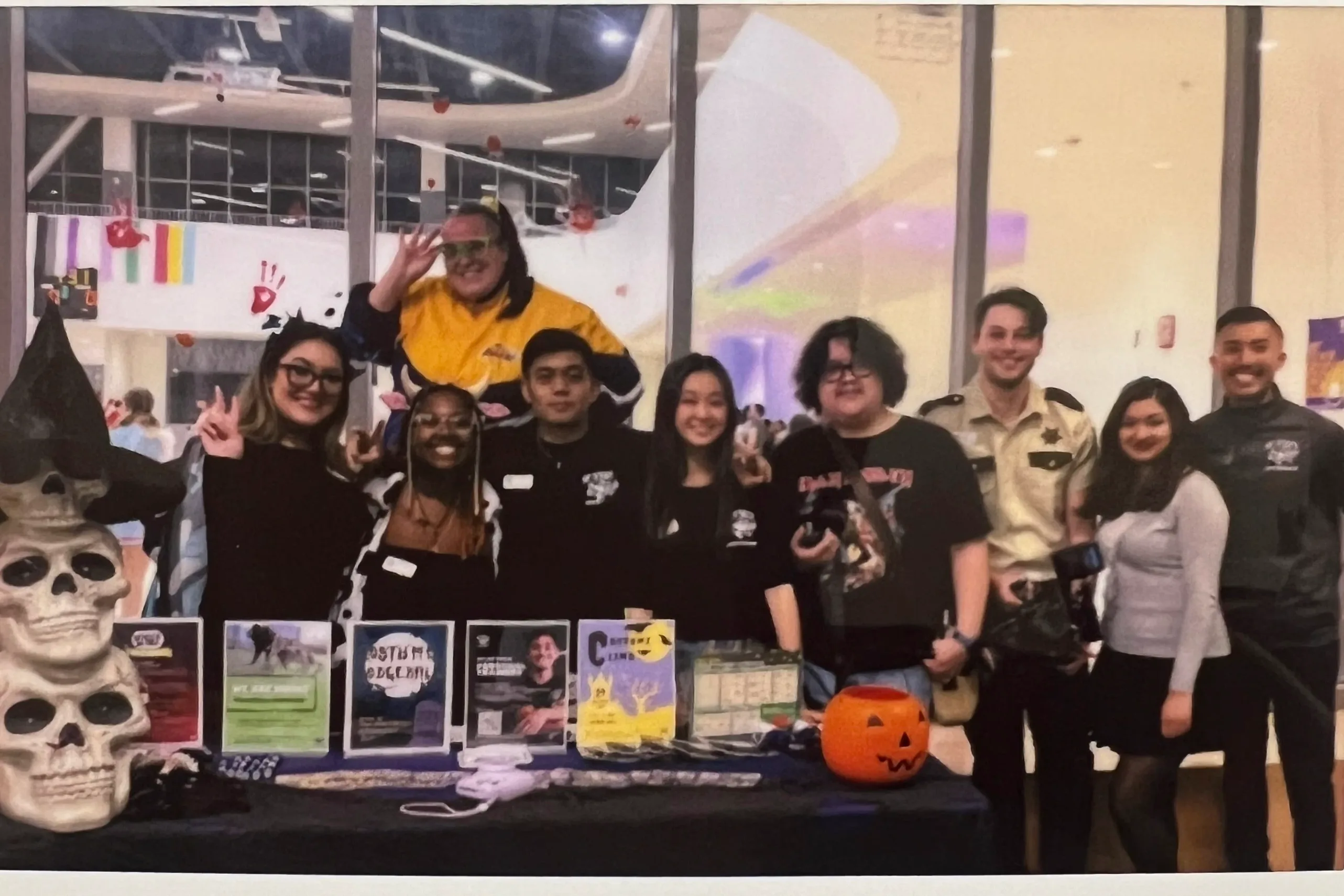
Four sheets is what survived
I did not archive my own work. Three years later this is what I still have: four finished pieces, no working files for most of them, and nothing from in between. I would keep receipts now, which is why this page is a look back rather than a rebuild.
Every one of them looked finished, and every one asked too much
Three years is enough distance to see the one habit running through all four. I drew each sheet as a complete document, when the job was to make a single decision easy. It cost me nothing at the time because nobody complained. It is the first thing I look for now, on anything I make.
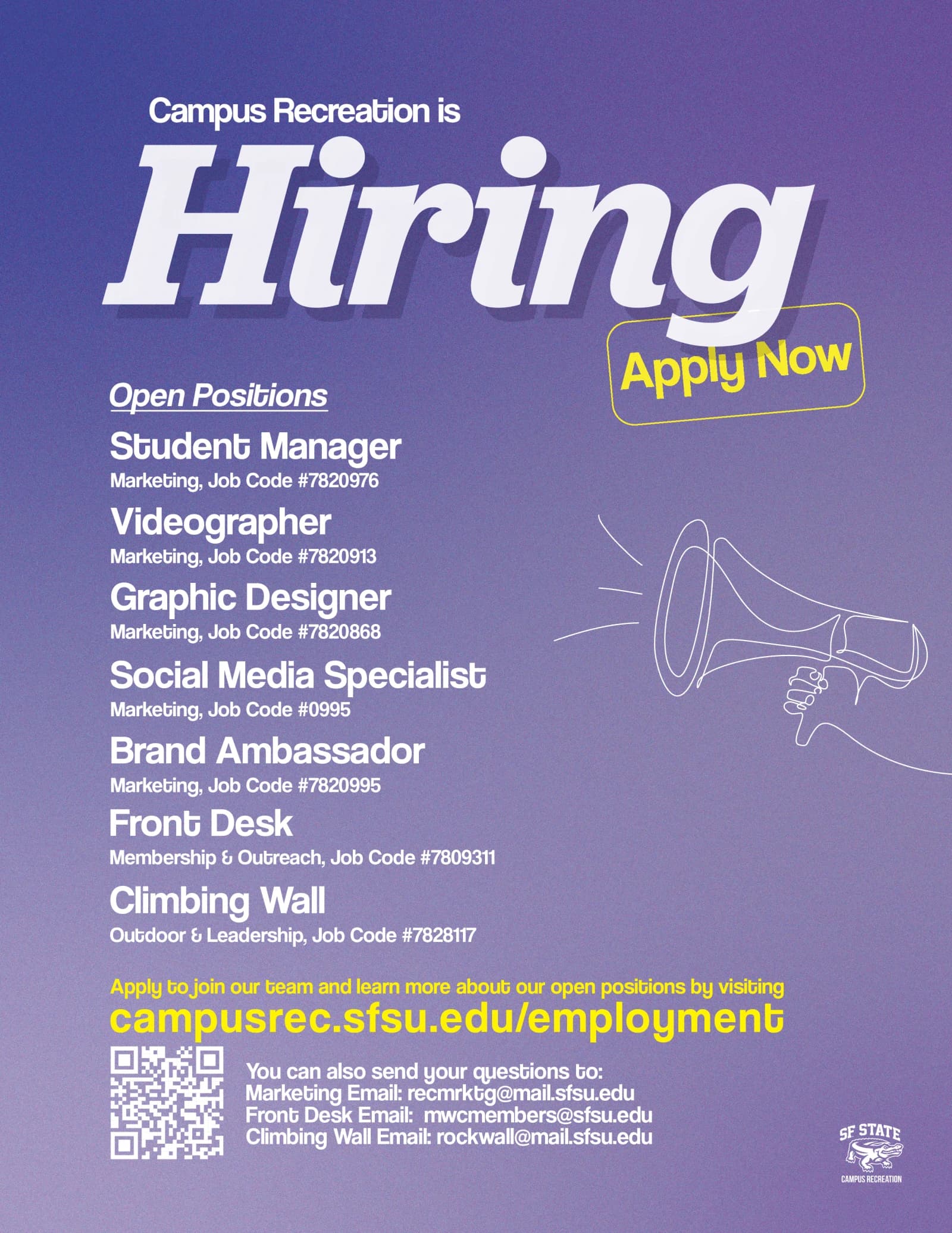
Campus Recreation is hiring
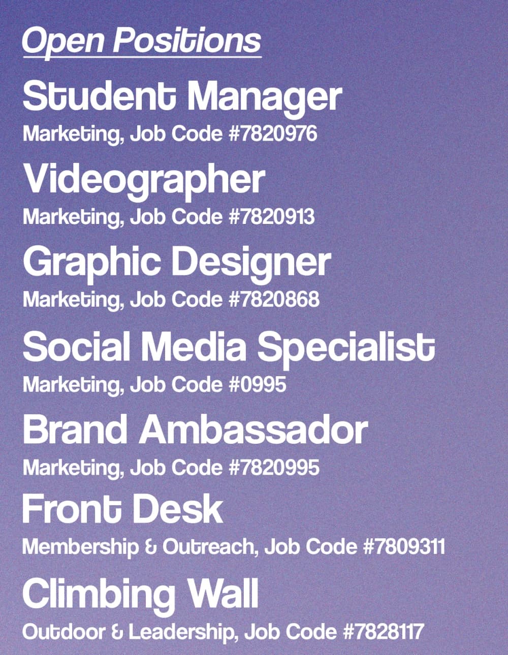
Seven open roles, a QR code, a URL and three email addresses, on one letter sheet at the front desk and in the department's feed.
Now
One heading per department rather than seven titles in a row, and no printed job codes. A code changed and the sheet was dead the same afternoon.
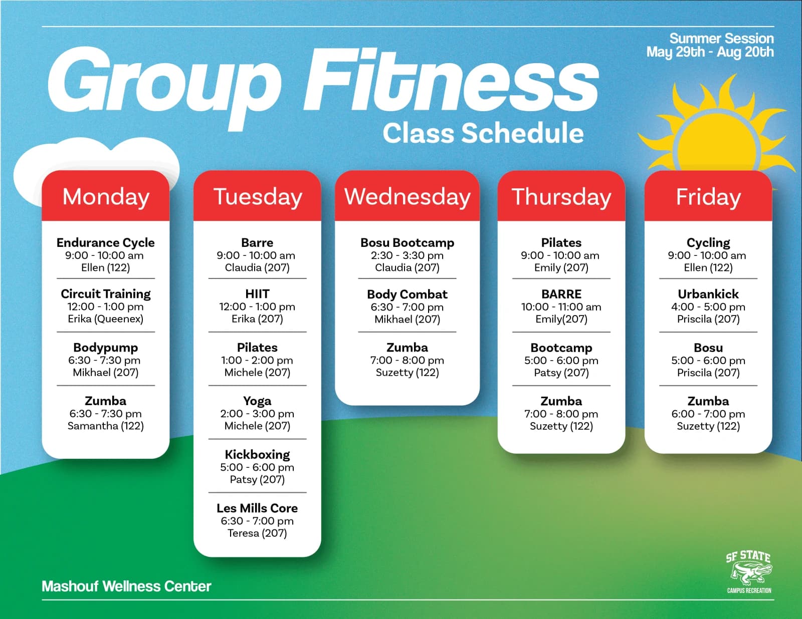
Group Fitness, summer session
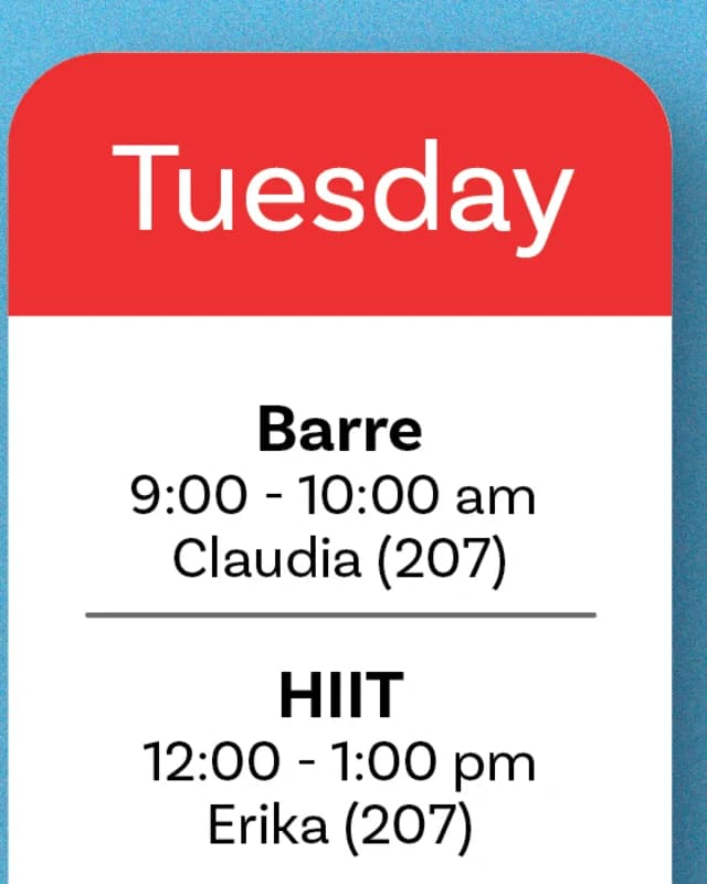
Five day columns, twenty-two classes, May 29 to August 20. It went up in the lobby, on the digital screens and in the feed, and it is the only piece here that got a second pass.
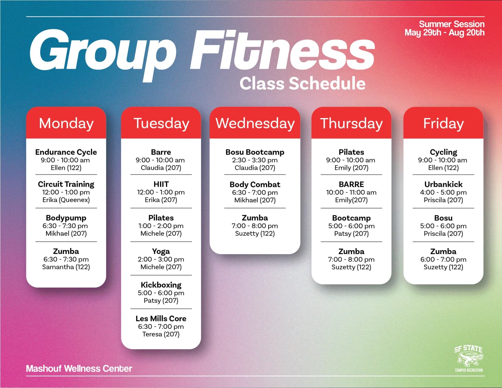
Same grid, same type, same five columns. All that changed is what sits behind them, and it moved the sheet from something you read as a colour across the lobby to something you read as a schedule.
Now
Let the class name carry the row and push the time and the room back. A student looking for a nine o'clock is reading twenty-two lines to find five.
Sierra Buttes backpacking trip
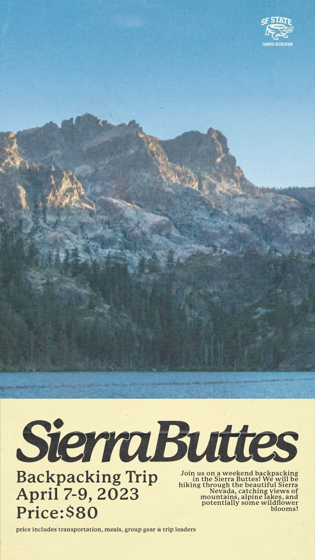
A weekend in the Sierra Nevada, April 7 to 9, eighty dollars including transport, meals, group gear and trip leaders. This one ran as an Instagram story, and the treatment is the closest I got to something I would still put my name on.

Now
A student decides on two facts here, the date and the price. Everything else supports them and should be set like it knows that.
Boathouse student manager
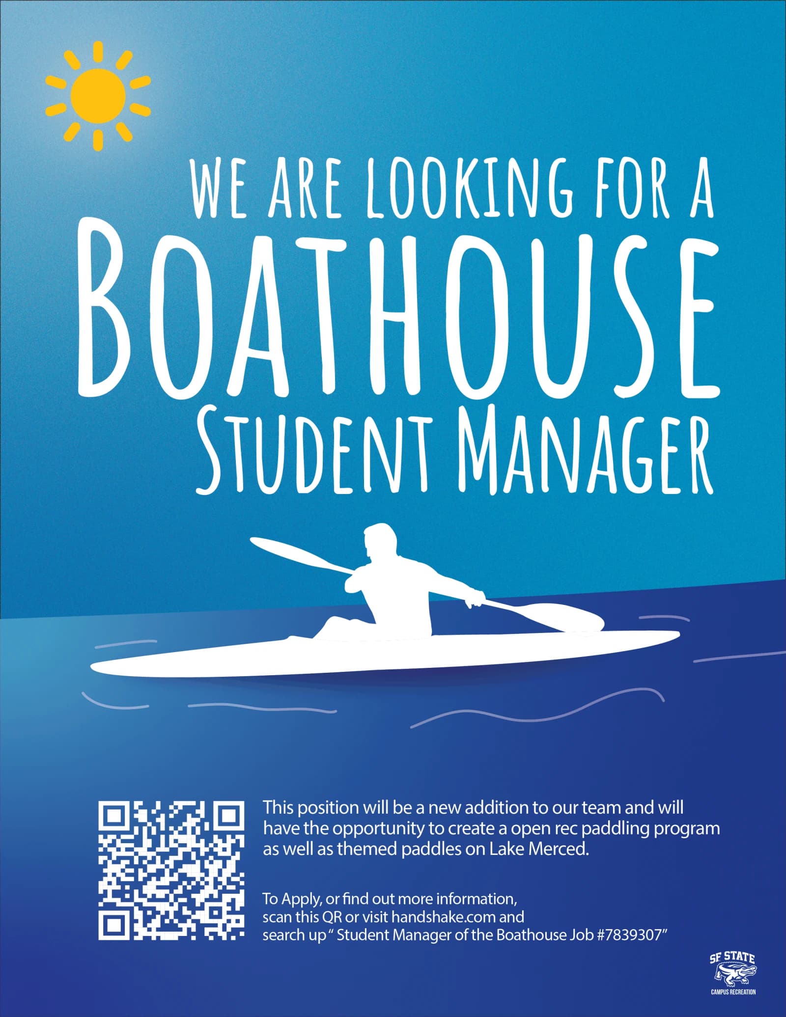
A role that did not exist yet, running an open rec paddling program on Lake Merced. The kayaker is drawn rather than stock, and it is the piece of craft on this page I am still happiest with.
Now
The flyer tells you to "scan this QR or visit handshake.com and search up Student Manager of the Boathouse Job #7839307". That is a set of directions, not a link, and it is set at the same size as the paragraph above it. A short URL and the QR would have done the whole job.
A queue, a template, and a blank artboard
Two or three events a week only works if most of the week is not new work.

Asana
Where the work came in, with the date it had to be up already attached. I could see a whole term at once, which is how I learned to start the slowest thing first instead of the loudest one.

Canva
Anything that came back every term, built as a template, so the front desk could swap the times on a schedule and print it without waiting on me.

Adobe Suite
The one-off work, drawn rather than assembled. The kayaker on the Boathouse flyer, and anything that had to leave as a print-ready file.
The templates are the part I would point at in an interview. One part-time student designer against a full term of deadlines only adds up if you stop being the bottleneck for everything that repeats.
What eight months of this actually taught me
For eight months I was a reason students knew things existed. A trip to the Sierra Buttes, a job on Lake Merced, a nine o'clock class on a Thursday. None of that reaches anybody on its own. It reached them because something I made said so, and because somebody else put it in front of them at the right moment.
I also worked the front desk as a student ambassador, so I stood next to that work while people read it. Watching somebody pick up a flyer, hunt for one fact and put it back down is still the fastest feedback I have had on anything I have made, and it is where the habit in all four of those sheets became obvious. I was designing for the person reviewing the file. Clarity is not how a thing looks; it is how little work it leaves the person reading it.
Closing thoughts
Thanks for reading. I have not made anything since without asking where it will actually be read and who is going to be walking past it. If you want to talk about any of it, or about what I would do with this work now, I'm around.