Rebranding T-Pumps
From “Popular Boba Spot” to a Scalable Identity System
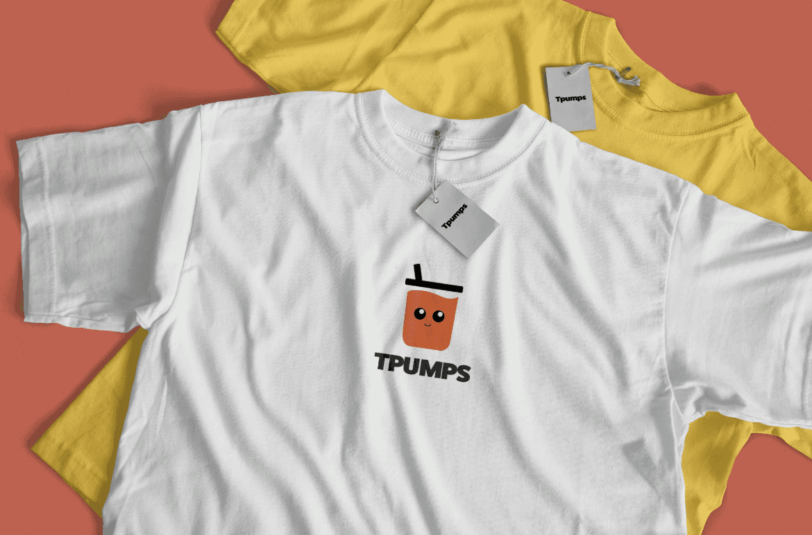
- Project
- T-Pumps Rebrand
- Type of Project
- Class Project Case Study
- Role
- Brand Designer
- Skills
- Prototyping, User Research, Mockups
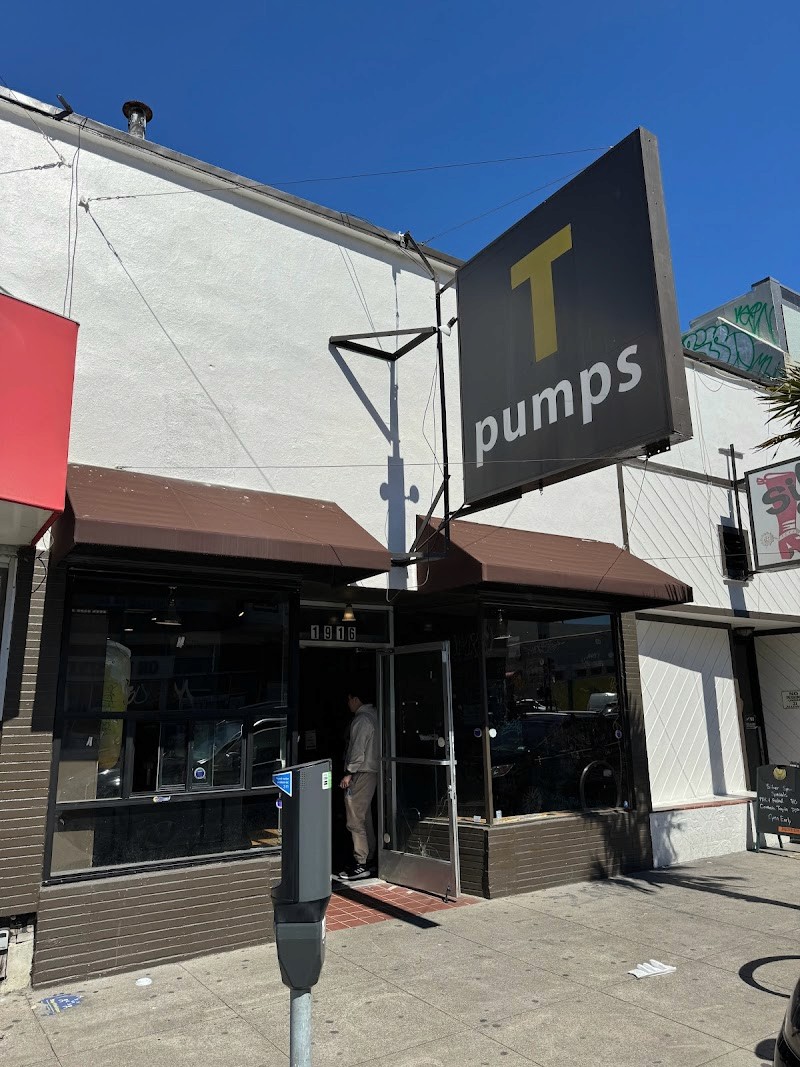
What is T-Pumps?
Tpumps is a Bay Area boba brand founded in 2011, known for fresh-brewed tea and a strong local following. Their mission is centered on brewing quality tea daily and keeping the experience approachable for the community.
Problem & Constraint
PROBLEM STATEMENT
Tpumps has a strong, loyal customer base, but its visual identity isn’t consistent. As a result, the brand experience changes across touchpoints, reducing recognition and limiting how well it can scale across locations.
Why it Matters?
- Inconsistent branding makes it harder to build recognition as the brand grows.
- A clear identity system improves trust, recall, and speed when rolling out new locations or assets.
DESIGN GOALS
The goal is to create a logo and identity system that feels friendly and inviting, stays simple enough to print on anything, and creates consistency across every Tpumps location.
Constraints
- Scale: Must work in small sizes (cups, stamps, rewards cards)
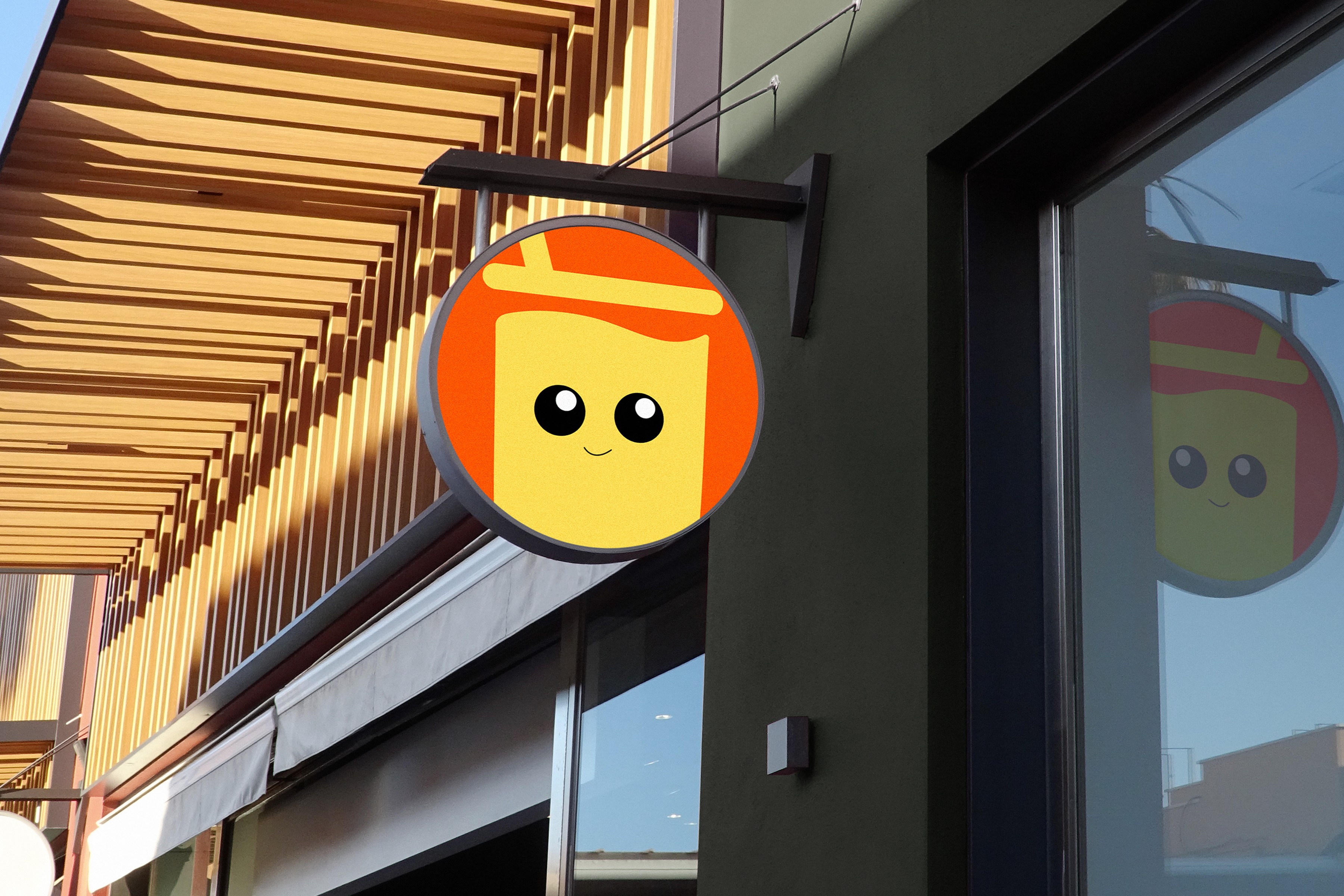
- Environment: Must scale to signage and storefronts
- System: Needs to be repeatable, not one-off art
Current Design System
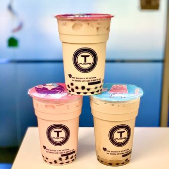
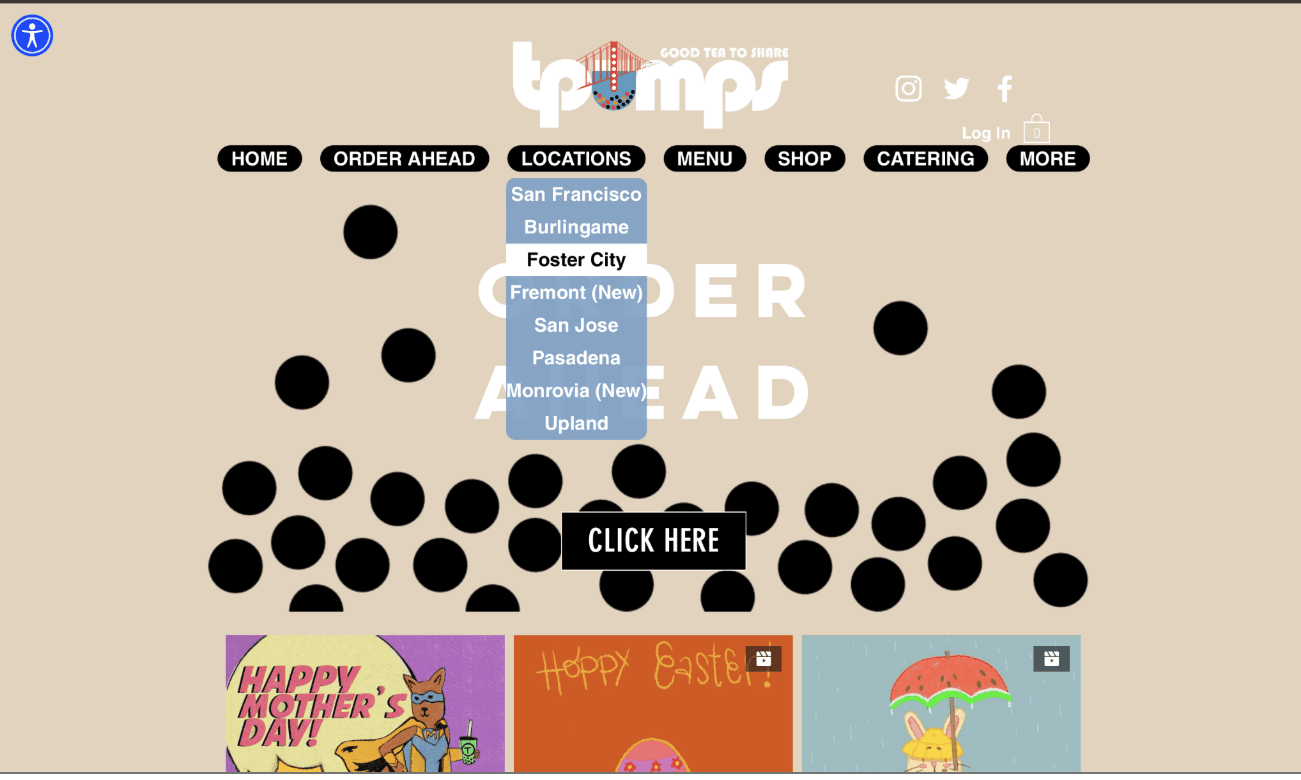
WHAT WORKS?
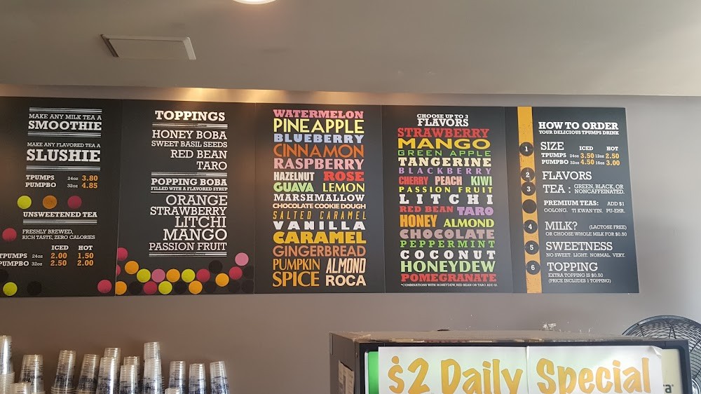
Friendly, playful tone: The bright color palette and expressive typography on the menu feel approachable and match the casual, fun energy of a boba spot.
Strong use of boba as a visual motif: Using tapioca pearls as supporting graphics creates a clear, on-theme visual language that feels ownable.
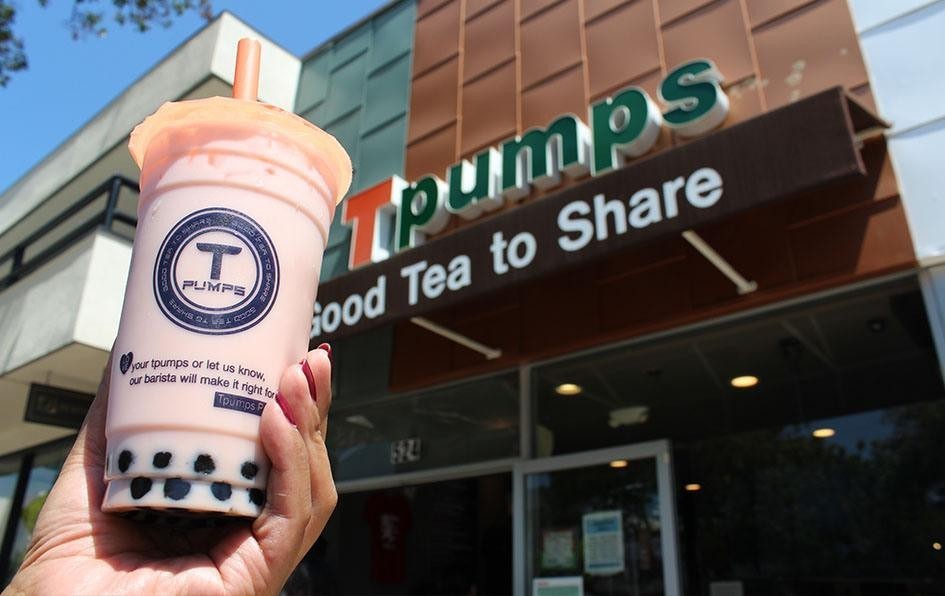
Clear brand message: The slogan “Great Tea to Share” reinforces Tpumps as a social experience—designed for hanging out with friends and community
WHERE IT FALLS SHORT?
Low brand recognition: The logo and overall system don’t feel distinctive or memorable, making it harder for Tpumps to register as an established chain.
Inconsistent visual identity: Elements across signage, packaging, and digital touchpoints don’t feel unified, which weakens the brand as it scales.
Typography mismatch in the logo: The current typeface choices don’t feel cohesive or well-aligned with the rest of the brand’s personality, reducing polish and clarity.
TLDR: While the brand has personality, it lacks a cohesive system that ties everything together into a recognizable, scalable identity.
THE AUDIENCE
T-Pumps’ core audience is teenagers and young adults, typically between 16–28. It’s the kind of place you go with friends — after school, late at night, or whenever you want something fun and familiar. Weekly promos and “bring-your-friends” deals make it feel social and repeat-worthy, not just a grab-and-go drink stop.
Understanding this audience is key, because it shapes how the brand should look, feel, and communicate. The design needs to feel playful, welcoming, and social — something that fits naturally into their everyday routines.
Design Direction
Based on the audit of Tpumps’ existing brand, I defined a clear design direction to preserve what already worked ~ playfulness and warmth ~ while addressing gaps in consistency, recognition, and scalability.
KEY PRINCIPLES
Playful, not chaotic
Maintain the fun, friendly energy of the brand while introducing clearer structure and restraint.
Simple & Recognizable
Create a logo and system that can be identified instantly, even at small sizes or from a distance.
Built to scale
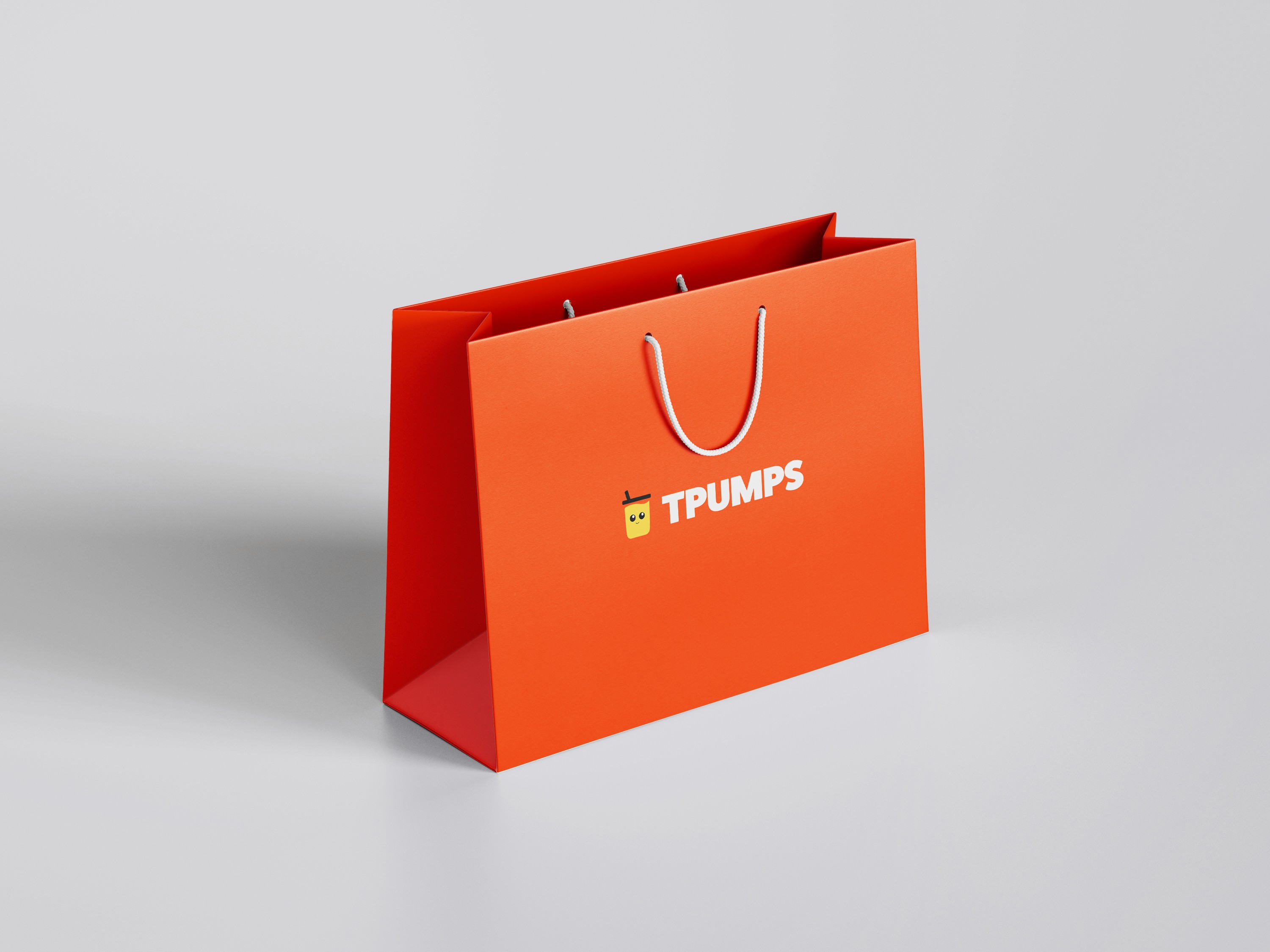
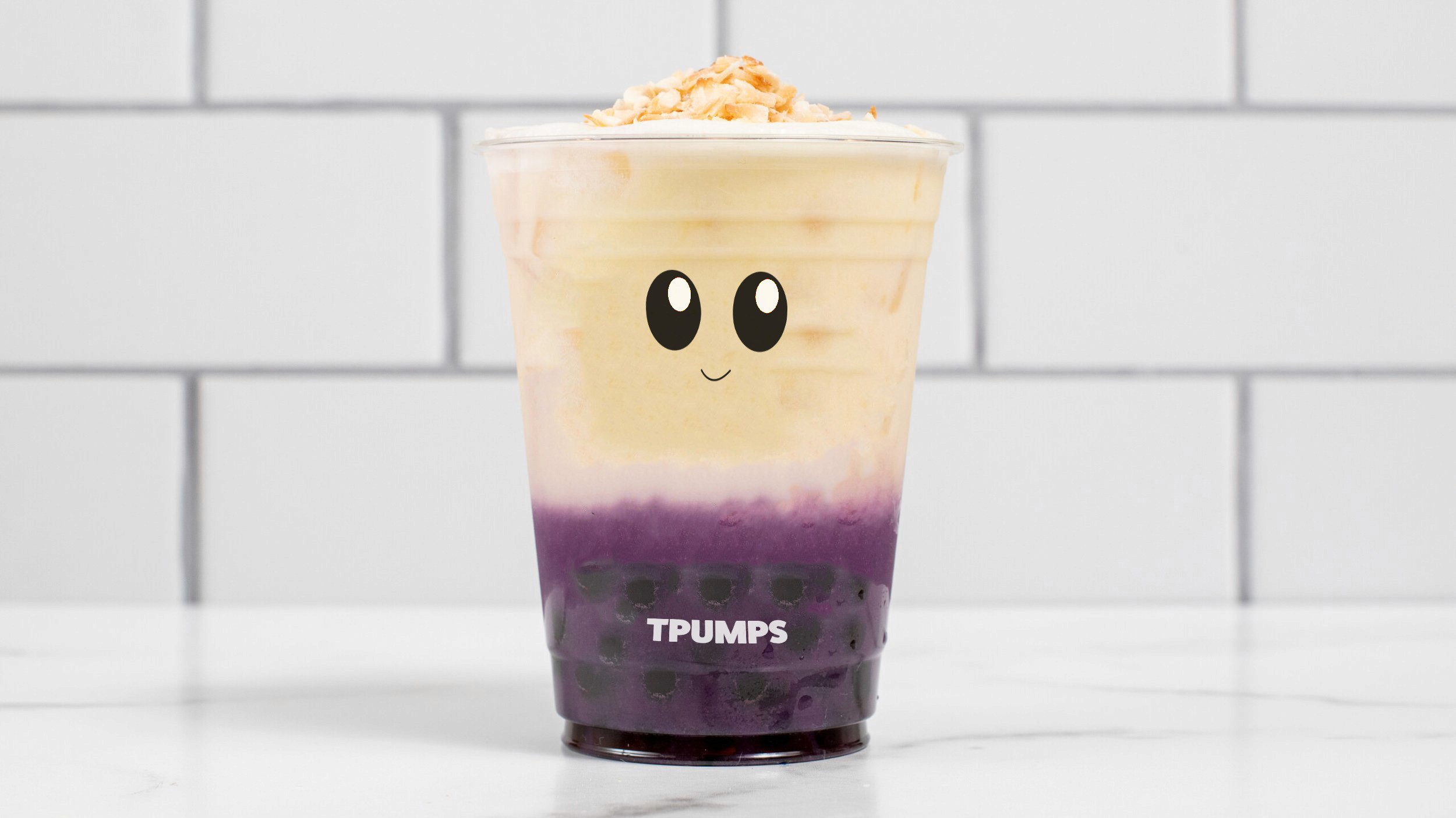
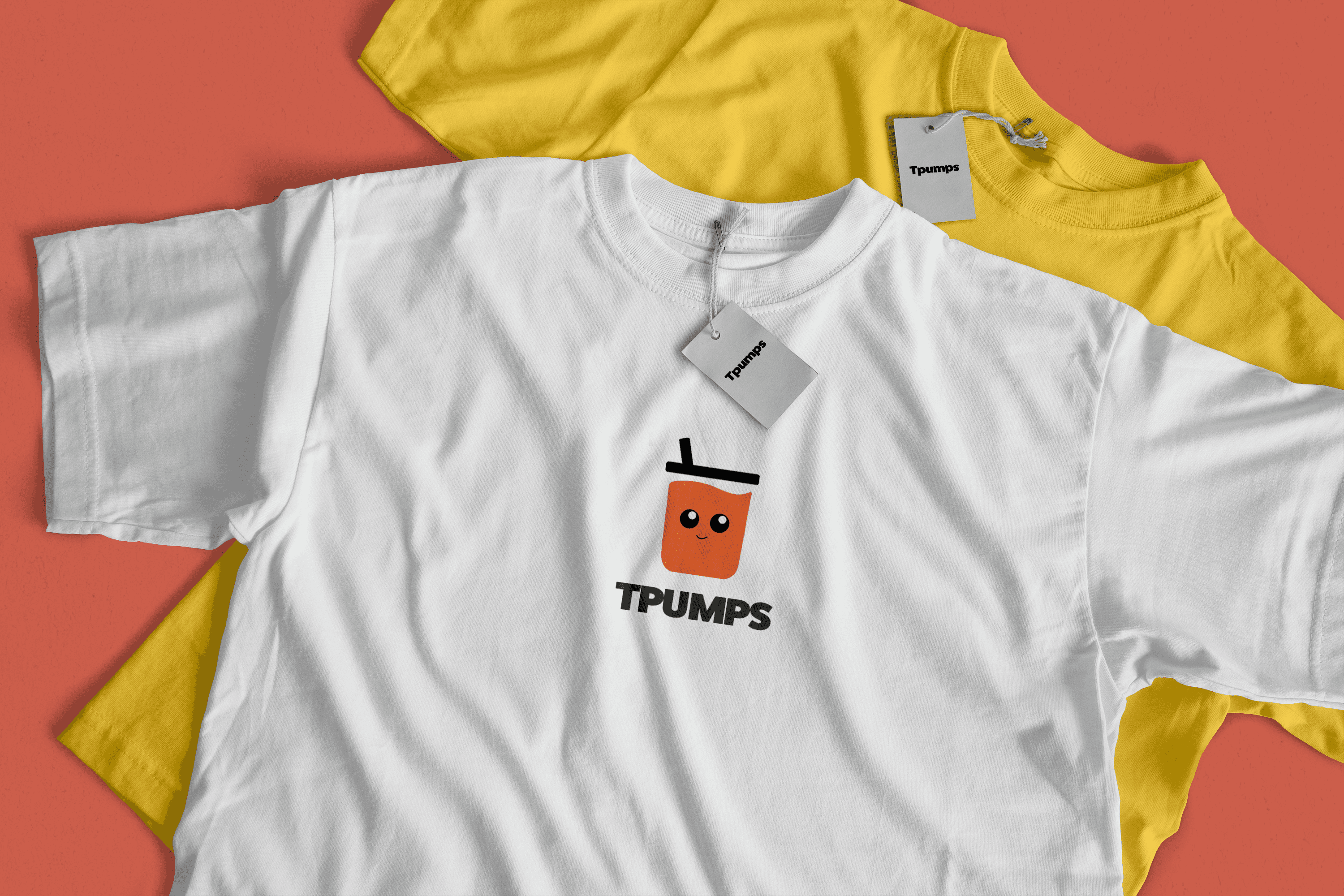
Design a repeatable identity system that works across cups, signage, packaging, and future locations.
Exploration
Using the design principles as a guide, I explored a range of logo concepts ~ testing how playful or simplified each direction could be while still feeling recognizable and scalable.
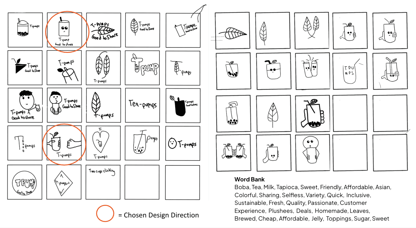
I started with quick, low-fidelity sketches to explore multiple logo directions, ranging from literal boba and cup illustrations to more simplified, symbolic forms. This helped clarify where the brand felt too busy versus where it became recognizable.
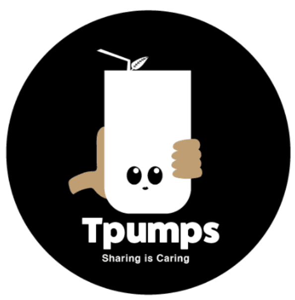
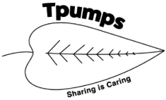
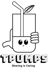
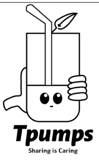
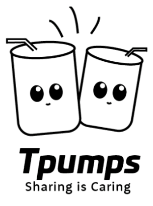
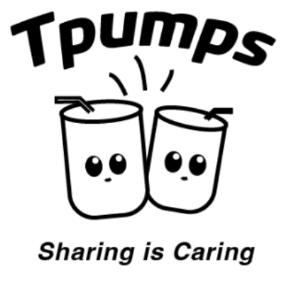
As concepts evolved, I realized the logo needed to be more abstract to scale well. While detailed ideas felt fun, they didn’t hold up across applications. The strongest direction kept the cup and boba as a simple, character-driven foundation.
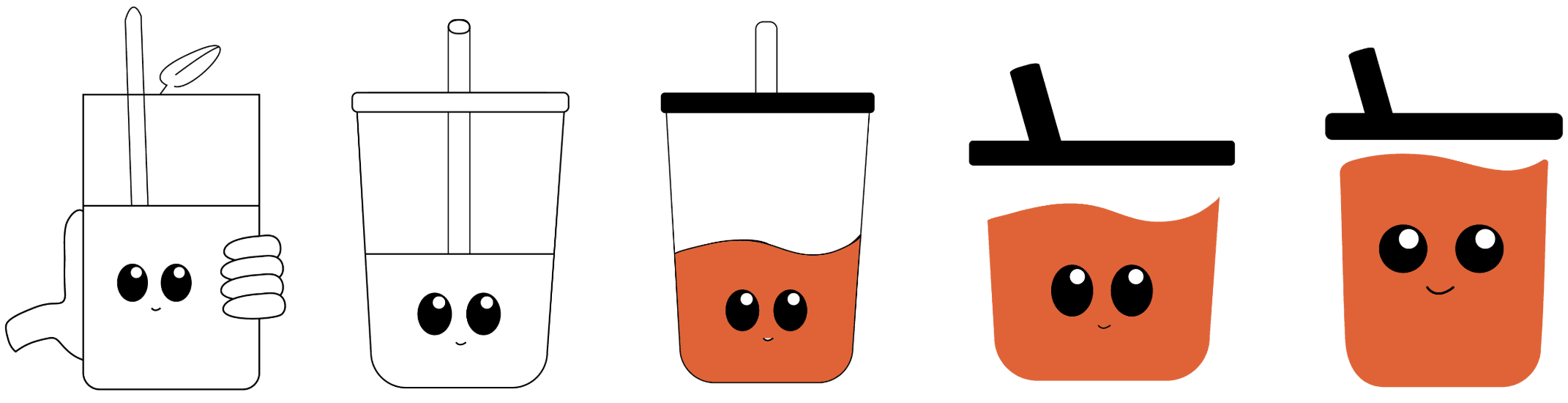
After getting feedback from peers, I took one direction and pushed it further ~ abstracting it into a simple, character-driven mark that could scale across the brand. It keeps the fun and joy Tpumps is known for, while working across all deliverables.
Brand Guide Lines & Mockups
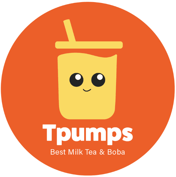
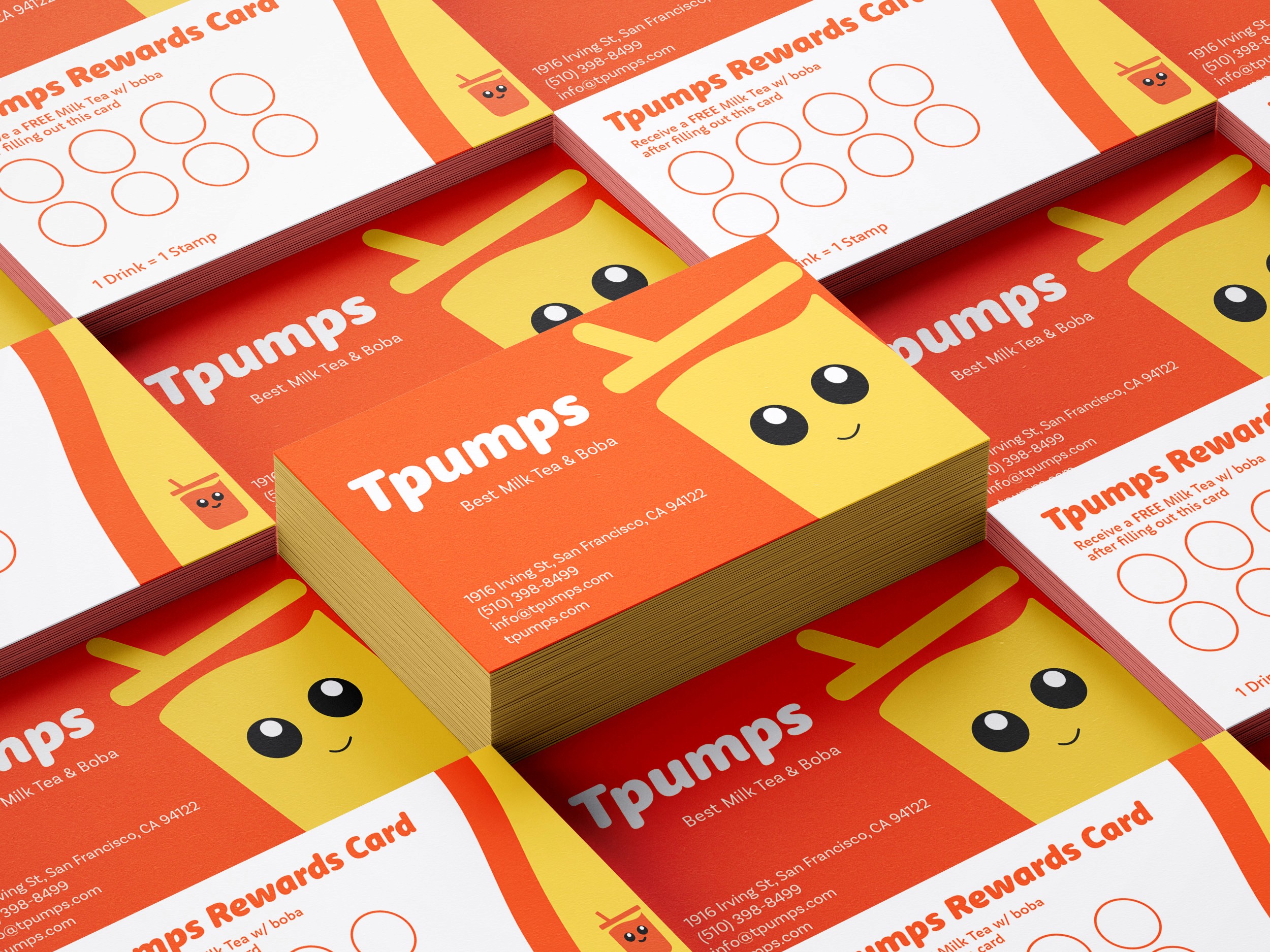
With the direction locked in, I translated the final concept into a cohesive brand system. This section outlines the core building blocks—color, typography, and the primary mark—that guide how Tpumps shows up across every touchpoint.
Primary Mark
Color Palette
RGB - #FF5400
CYMK- 0%, 67%, 100%, 0%
RGB - #FFD84A
CYMK - 0%, 15%, 71%, 0%
RGB - #222423
CYMK- 6%, 0%, 3%, 86%
Fonts
Used for Headers

Used for Body Text

Reflection & Takeaways
This project pushed me to think beyond individual visuals and focus on building a system that could scale. Early on, I was drawn to more detailed and expressive ideas, but iteration showed that clarity and restraint were key to making the brand feel recognizable and consistent.
Simplifying the mark and leaning into abstraction allowed the identity to stay playful while becoming more flexible across real-world touchpoints like cups, signage, and packaging.
What I’d do next
If I were to take this project further, I’d expand the system into additional touchpoints such as menu hierarchy, in-store signage, and social templates to test how the brand holds up at scale. I’d also explore how the character could adapt across seasonal campaigns without losing its core identity.

Closing Thoughts
Thanks for taking the time to dive into this project. If you want to explore the designs further, I’m happy to share the full Figma file — just reach out.
If anything here sparked ideas or questions, feel free to connect with me on LinkedIn. I’d love to keep the conversation going and hear your thoughts.